Jeevansathi iOS Redesign
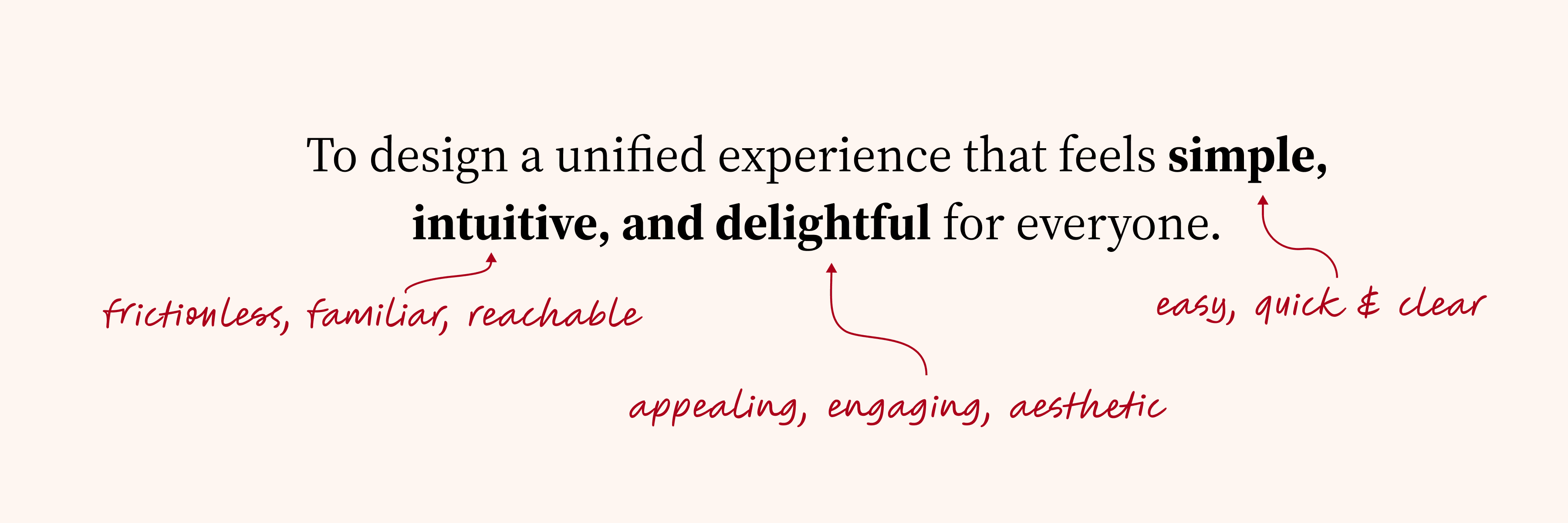
To design a unified experience that feels simple, intuitive and delightful for everyone
Introduction
Jeevansathi is one of India's largest matrimonial platforms — but its iOS app had not been meaningfully redesigned in over a decade. Features had been patched in over time, but the foundation was broken. iOS contributed only ~10% of total Daily Active Users, retention sat at 40%, and App Store reviews consistently called the experience outdated and hard to use.
Redesigning the Jeevansathi app is imperative to meet the changing needs of users and align with modern aesthetic values. By refreshing the interface, integrating new features, and enhancing accessibility, the redesign ensures that Jeevansathi remains competitive, engaging, and trusted in helping users find their perfect match.

The Problem
Despite Jeevansathi's brand recognition, the iOS app had stopped earning user trust. Navigation was buried behind a hamburger menu. Profile cards were inconsistent. UI patterns varied across screens as if built by different teams over different years.
The actual user base was more complex than one persona: young professionals searching independently, older adults less familiar with digital interfaces, and parents managing profiles on behalf of their children. None of them were being served well.
iOS share of DAU was only ~10%, despite the platform having a comparable user base on Android. The gap wasn't about marketing — it was about experience. Users were landing on a product that felt outdated before they even explored it.
The App Store rating sat at 4.1, and when we reviewed the reviews in detail, "outdated design" was the most repeated complaint. Users weren't just rating the features — they were rating how the app made them feel.
Retention was at 40%, which meant 6 in 10 users who downloaded the app never came back after their first session. The product wasn't giving them a strong enough reason to return — no clear next step, no moment of delight, no sense of progress.
Research & Discovery
Understanding our users
Research and analyse
Define goals and project distributions
Ideation and brainstorming
Design and deliver
Design Challenge
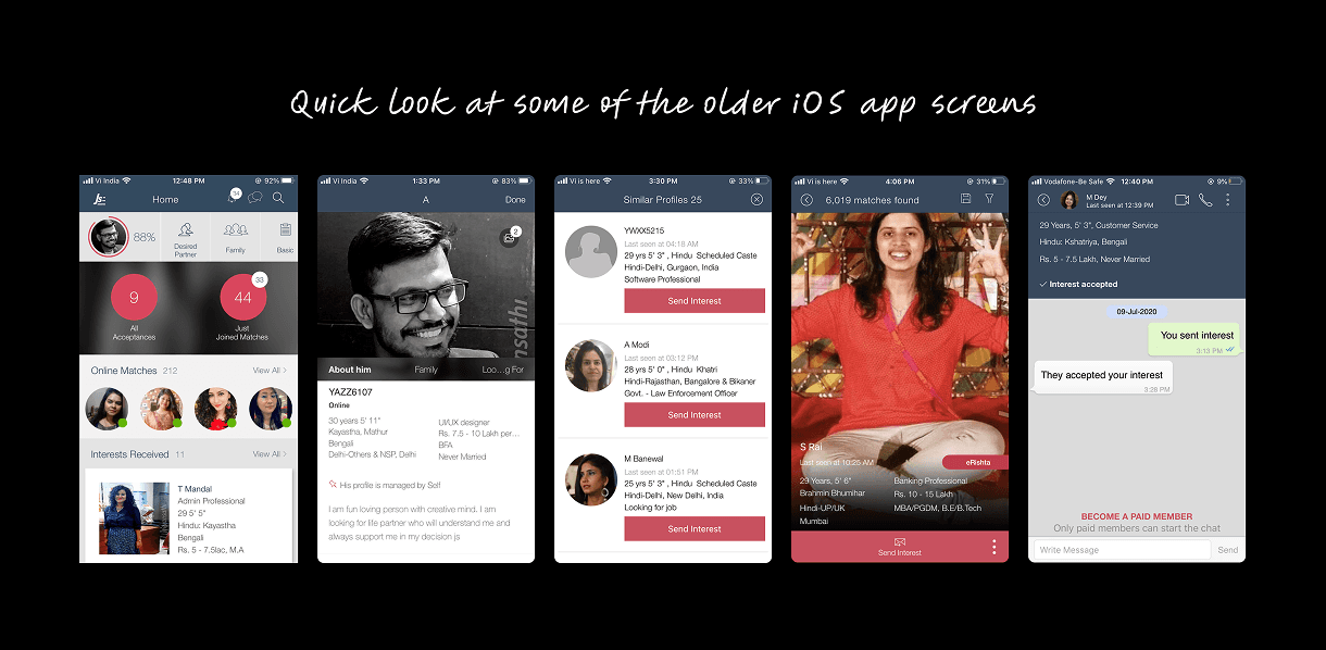
Exploring Directions — before deciding on a visual direction, we stress-tested a wide range of aesthetics. Some pushed toward dating app styles (Tinder, Bumble), others leaned conservative and trust-first. This exploration gave design, PM, and leadership shared context that eliminated debates later.
What we rejected: Dating app aesthetics were visually exciting but emotionally wrong. Matrimonial decisions are high-stakes and trust-dependent — the experience needed to feel considered, not casual.
What we chose: A modern, clean direction grounded in warmth and clarity. Contemporary enough to feel fresh, restrained enough to feel trustworthy.
Quick look at some of the older iOS app screens
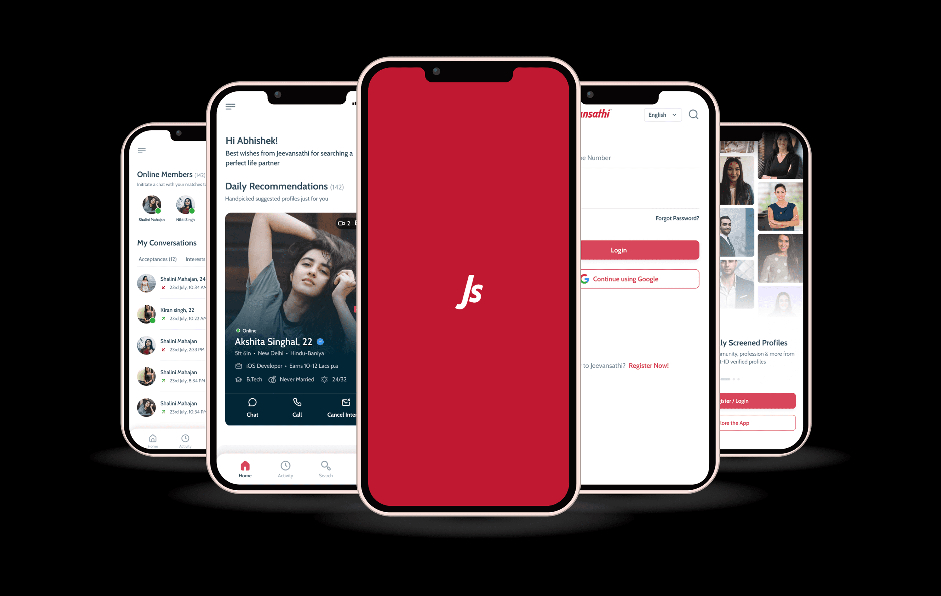
New Design
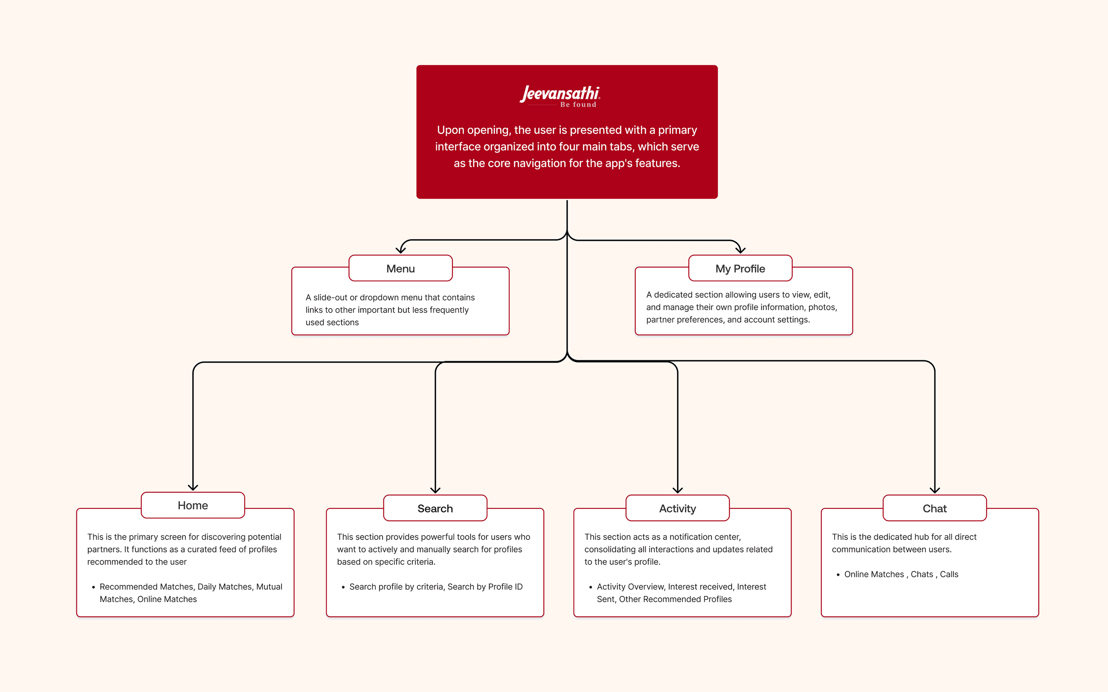
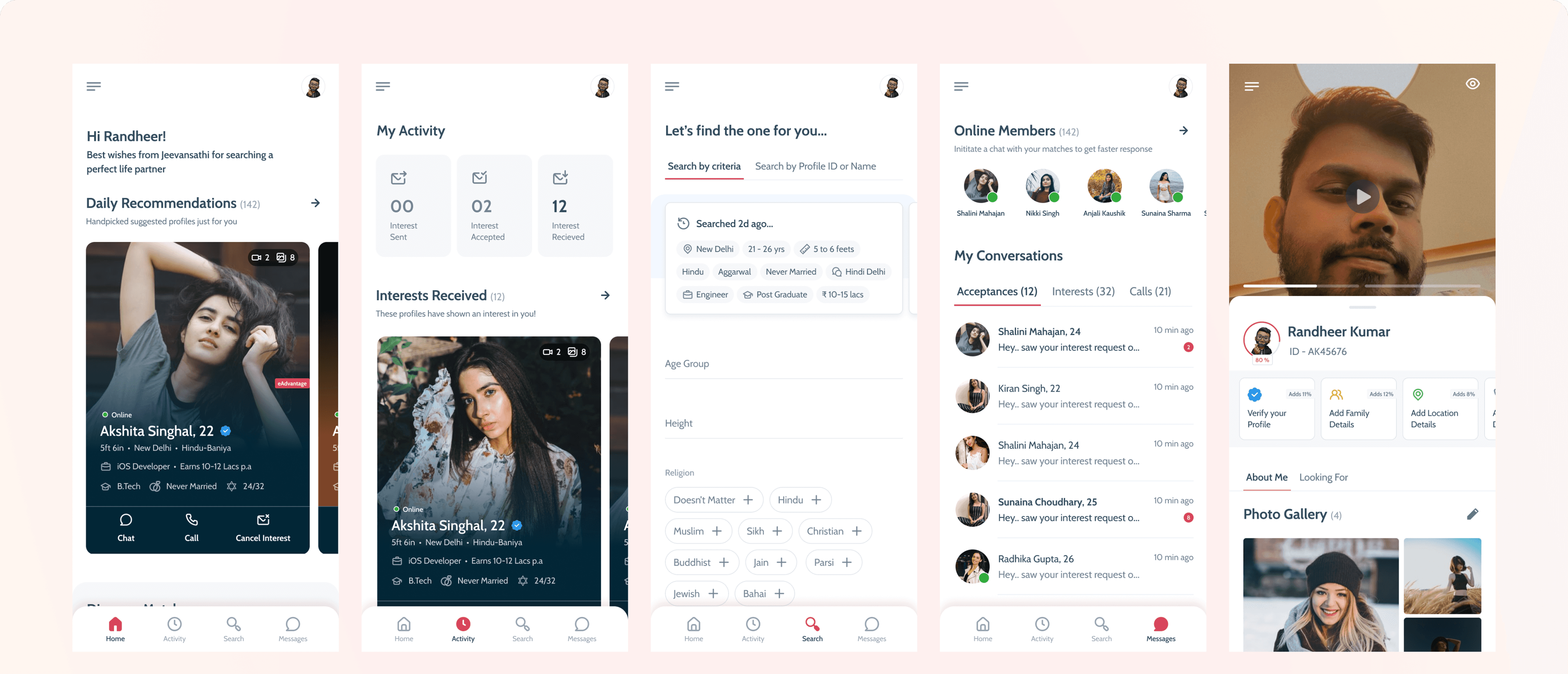
Decision 1 — Bottom Navigation
The existing app relied entirely on a hamburger menu. Our research showed users visited the same four areas in almost every session: browsing matches, checking activity, searching, and messaging. Burying these behind a single tap added friction to the most frequent actions on the platform.
We introduced a persistent bottom navigation bar with four labeled tabs: Home, Activity, Search, and Messages. For a platform where users check in multiple times a day, removing even one tap from every session meaningfully impacts retention.
Result: this single structural change was the primary driver of our retention improvement from 40% to 55%.
Building Design Systems
After finalizing the theme, we moved on to componentizing the design elements for faster and more consistent output. We built an advanced design system using atomic design principles.
This involved defining foundational elements like color palettes and typography, followed by creating molecular-level components such as buttons, input fields, list items, and radio buttons. Using these molecules, we developed functional components like dropdowns, profile cards, navigation bars, and forms.
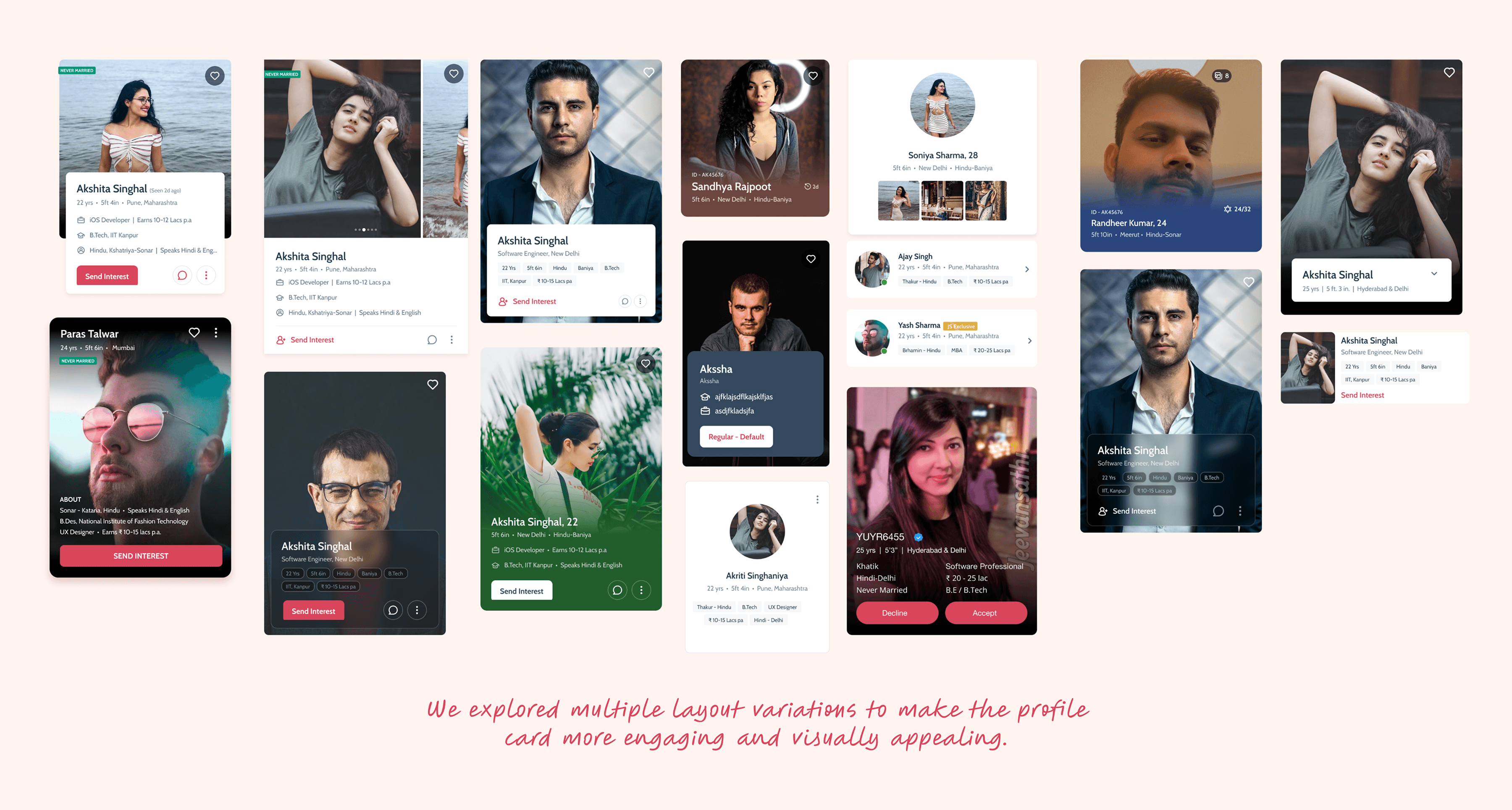
Decision 2 — Redesigning the Profile Card
The profile card is the most consequential surface on a matrimonial platform. Every match decision starts here. We treated it accordingly.
We explored multiple layout directions — photo-dominant, information-dense, swipeable formats — and tested variations with real users across age groups. The tension was consistent: users wanted emotional connection through the photo, but also needed key information immediately to decide.
One specific insight shaped the final visual treatment: Jeevansathi has an enormous range of profile photo quality. A light card background made lower-quality photos look worse. We shifted to a subtle dark card background, creating visual consistency regardless of photo quality — and giving the product a more premium feel.
Information Architecture
Decision 3 — Micro-interactions & Guided Animations
One of Jeevansathi's largest and most underserved segments is parents — many less digitally fluent, more likely to abandon when something doesn't respond as expected.
We introduced micro-interactions on all primary actions — tapping a button, sending an interest, confirming a match — to provide immediate, visible feedback. These are not decorative. They are functional signals: "this worked." For parents and older users, that feedback is essential to building confidence in the app.
For first-time users of any age, we designed guided animations within empty states. Rather than a blank screen, the app explains what the section is for and how to get started. This reduced early drop-off by giving users a reason to take their first action instead of a reason to leave.
Profile Card Explorations
Outcome
DAU Growth: Contribution of iOS to overall DAU increased by 21%, showing a significant lift in daily engagement after the redesign.
Retention Improvement: Retention rate improved from 40% to 55% within just 40 days, reflecting stronger stickiness and user satisfaction.
Ratings Boost: The iOS app rating jumped from 4.1 to 4.6, driven by the modern design and improved usability. New users especially highlighted the design as a reason for their positive reviews.
Positive User Feedback: Reviews on the App Store praised the cleaner interface, smoother navigation, and the overall improved experience. Many users specifically mentioned the redesign as a "fresh start" for the app.
Team Enablement: The new design system not only improved the user experience but also accelerated development speed, making future iterations and feature launches more seamless.
Retrospective
Process is not overhead — it is insurance. The time we spent building the design system before designing screens felt slow at first. It saved us weeks of rework and set up two years of faster product development.
Quantitative data tells you where the problem is. Qualitative data tells you why. Our retention and DAU numbers showed us iOS was underperforming. User interviews told us the app made people feel like the company didn't care about them. We needed both to know what to fix and how.
On a platform this complex, alignment is a design deliverable. Getting the visual exploration done early and sharing it openly meant that every decision that followed had genuine buy-in, not reluctant sign-off.
Good design isn't about making things beautiful. It's about rebuilding trust, solving real problems, and creating experiences people enjoy using again.