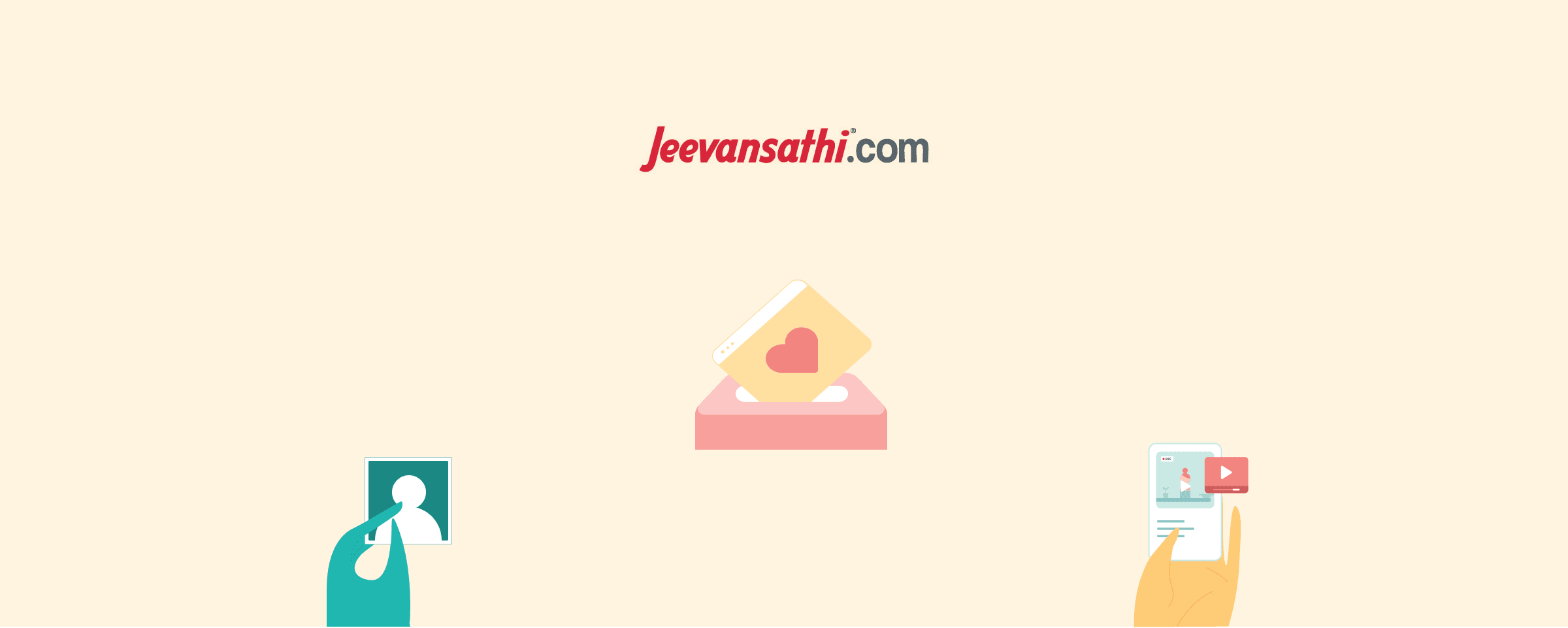
Building a New Illustration Style for Jeevansathi
Revamping the Jeevansathi iOS app with a fresh, inclusive visual language
Introduction
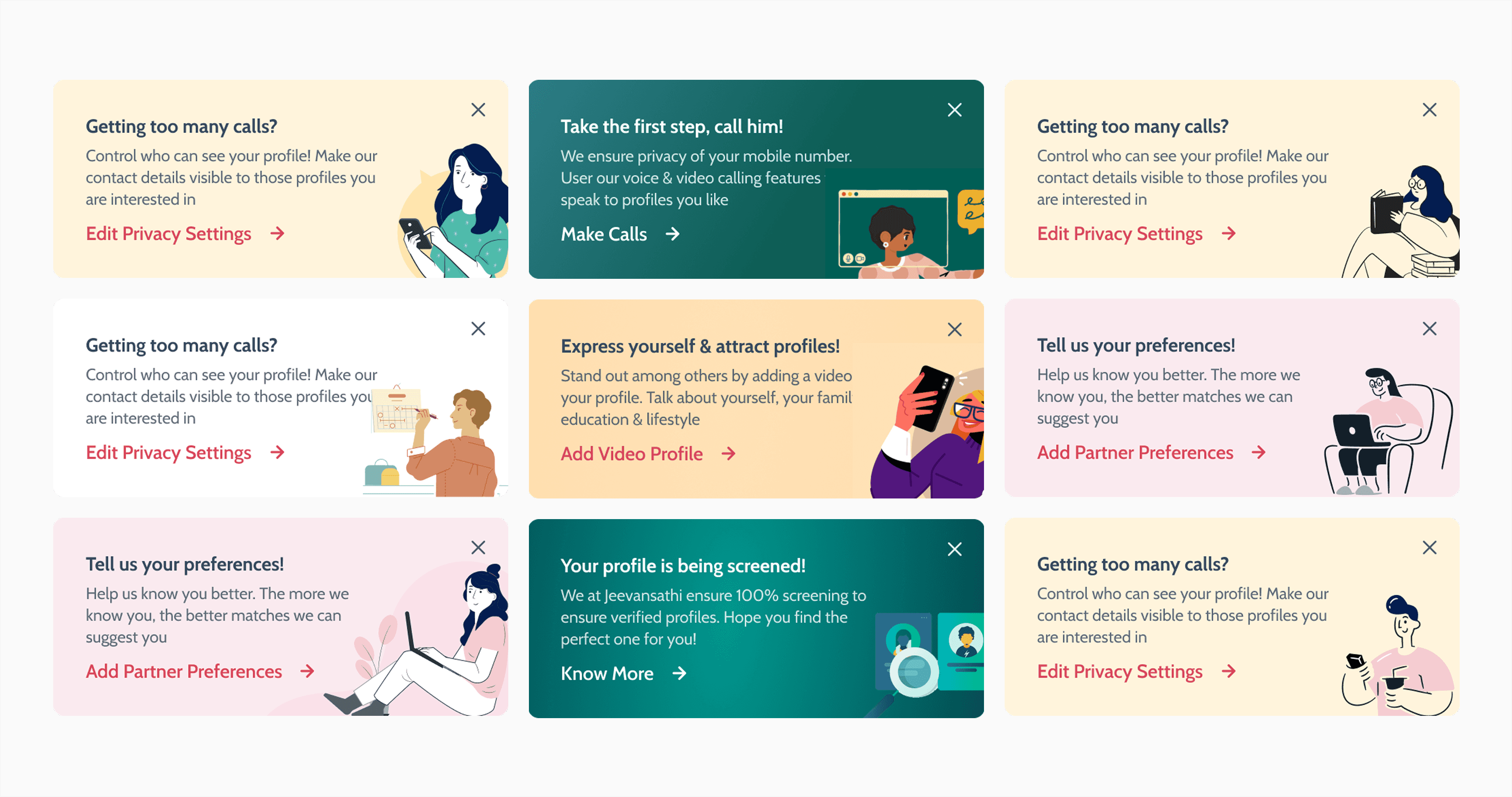
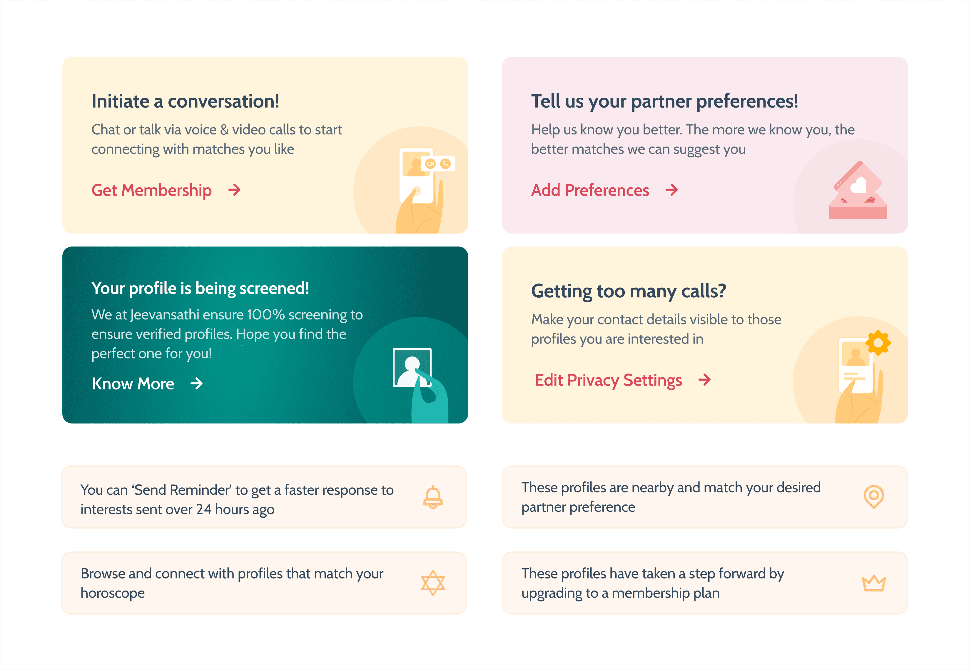
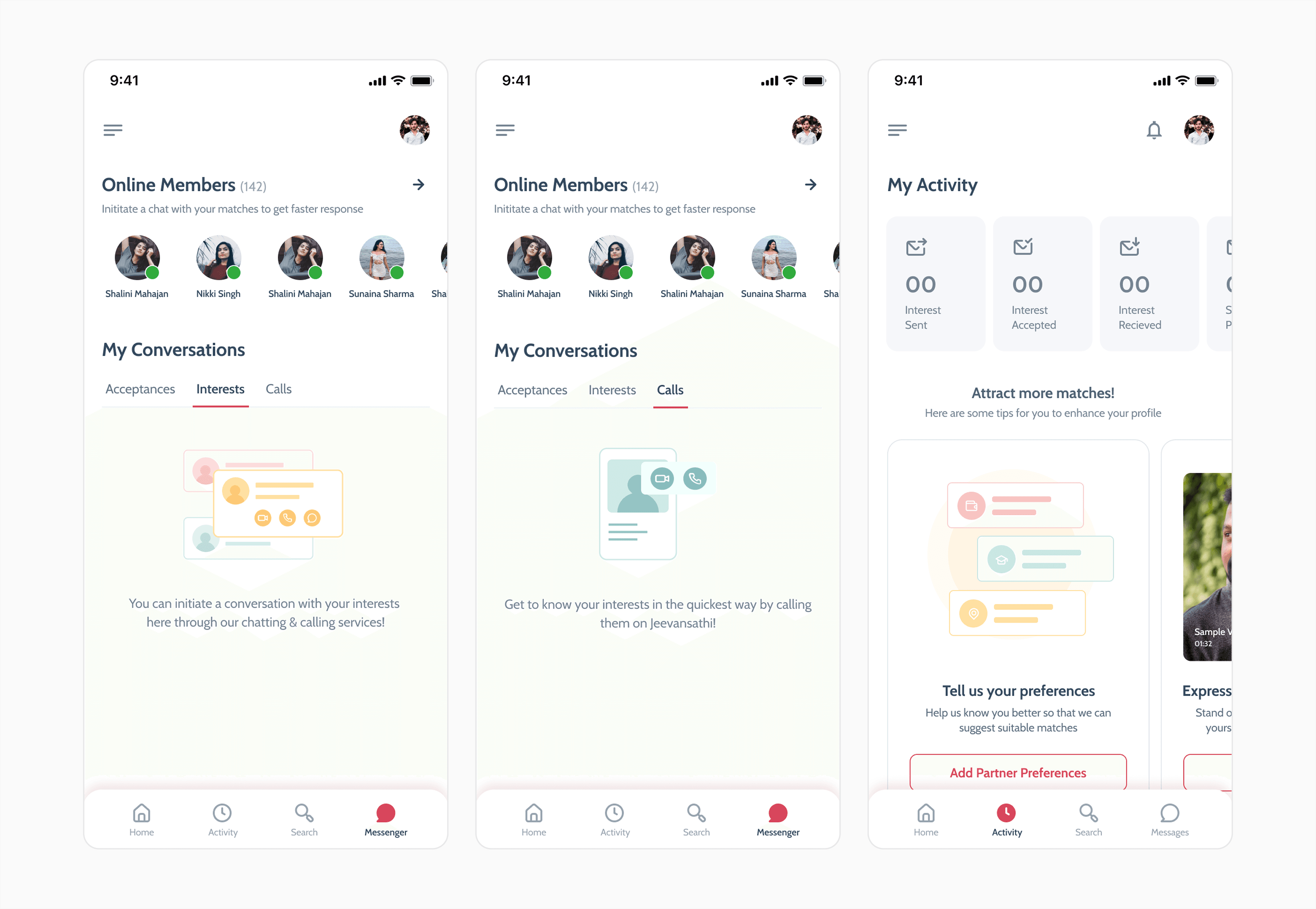
After a decade of minimal updates, the Jeevansathi app underwent a transformative redesign with illustrations leading the way. This fresh visual language brought warmth, simplicity, and modernity, creating an engaging and cohesive user experience.
The Problem
The project came with its fair share of challenges, especially since this was my first time working on illustrations after focusing primarily on UI/UX design. Our existing product already had a set illustration style, which led to confusion about whether we should tweak the current designs or create something entirely new.
With a tight deadline of just 15–20 days, the pressure was on to deliver visuals that would resonate with a diverse audience, ranging from parents in tier 1 cities to those in tier 3. To make things more complicated, the product had already been designed without considering how illustrations would fit into the overall style, making integration a real challenge. On top of that, I found myself questioning whether to use predefined libraries or create something custom. Despite the chaos, I stayed driven by my goal of pushing boundaries and refusing to settle for the bare minimum, even when time and resources were limited.
Getting Started
I started by collecting resources, reading blogs, gathering current illustrations, exploring available open and paid libraries, and then started fitting those into our product's visual language.
Reference & Inspiration
The story behind Airbnb's illustration system strongly resonates with our product, especially their commitment to representing diverse faces and races. Built on principles of groundedness, scalability, lightness, and diversity, their approach sets a high bar for authentic representation across age, gender, ability, and culture. By grounding their work in real photography and collaborating with communities, they created a bold, inclusive visual language. However, achieving this level of detail and meaning can feel daunting for designers who are new to illustration.
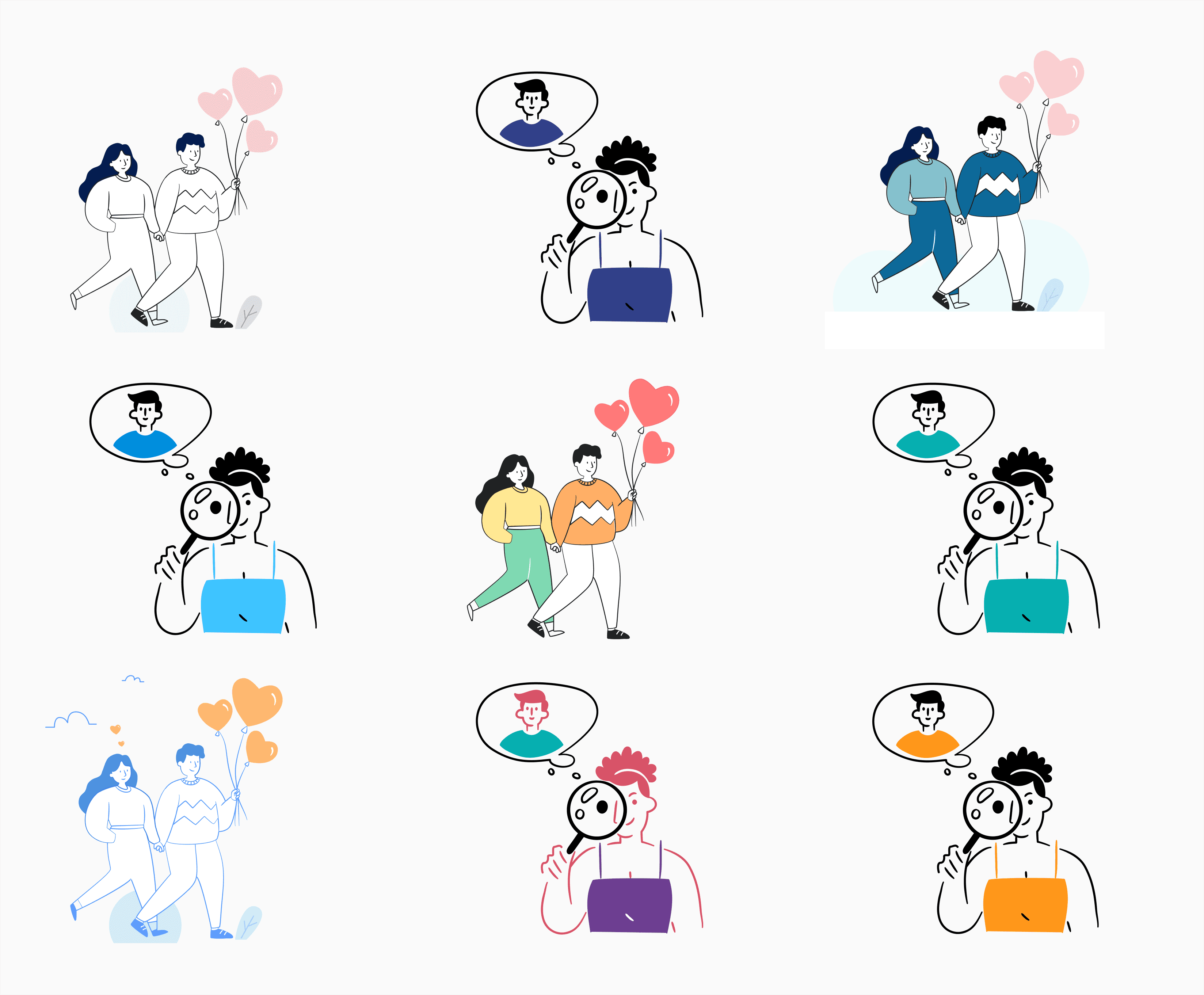
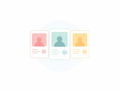
Iteration 1
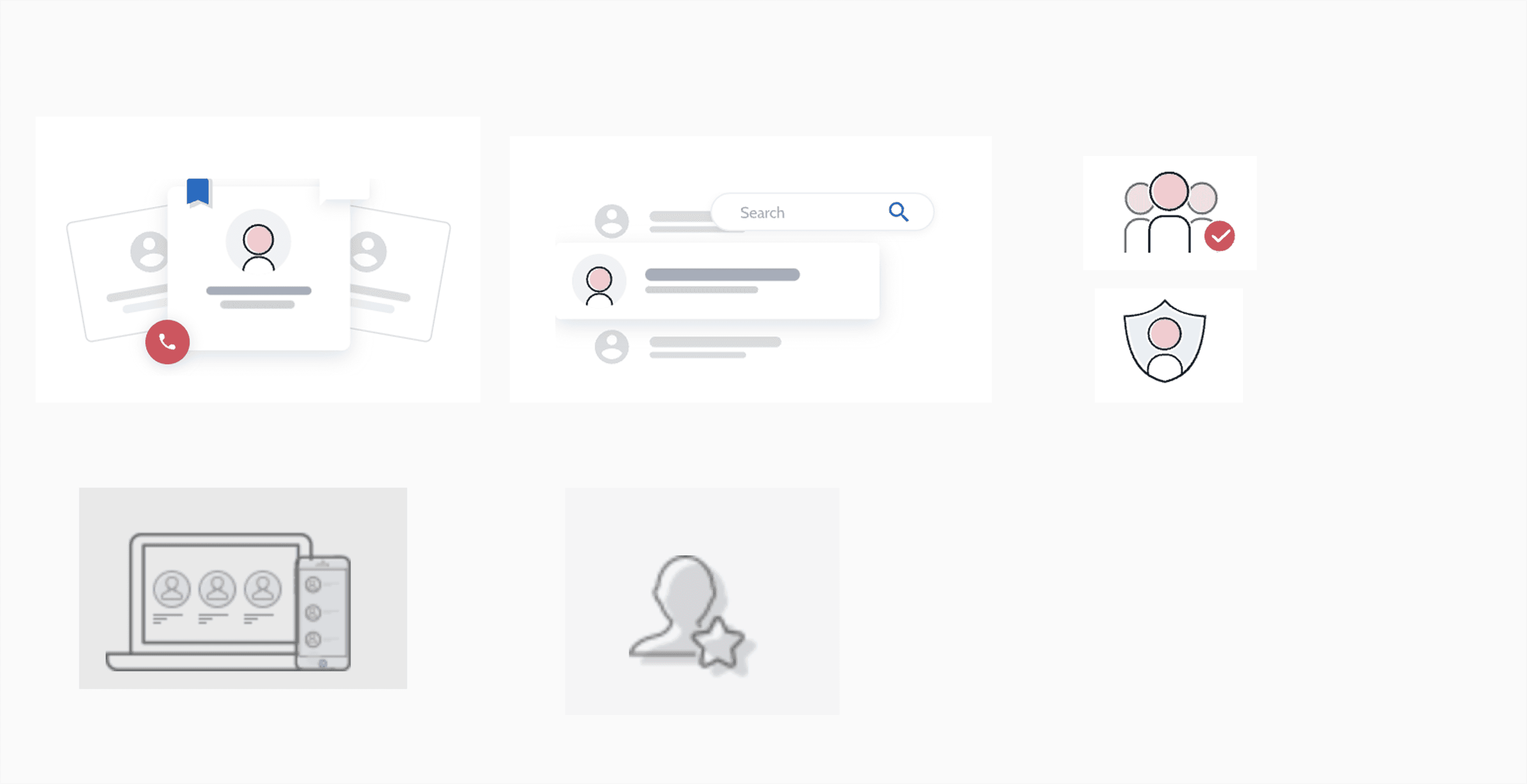
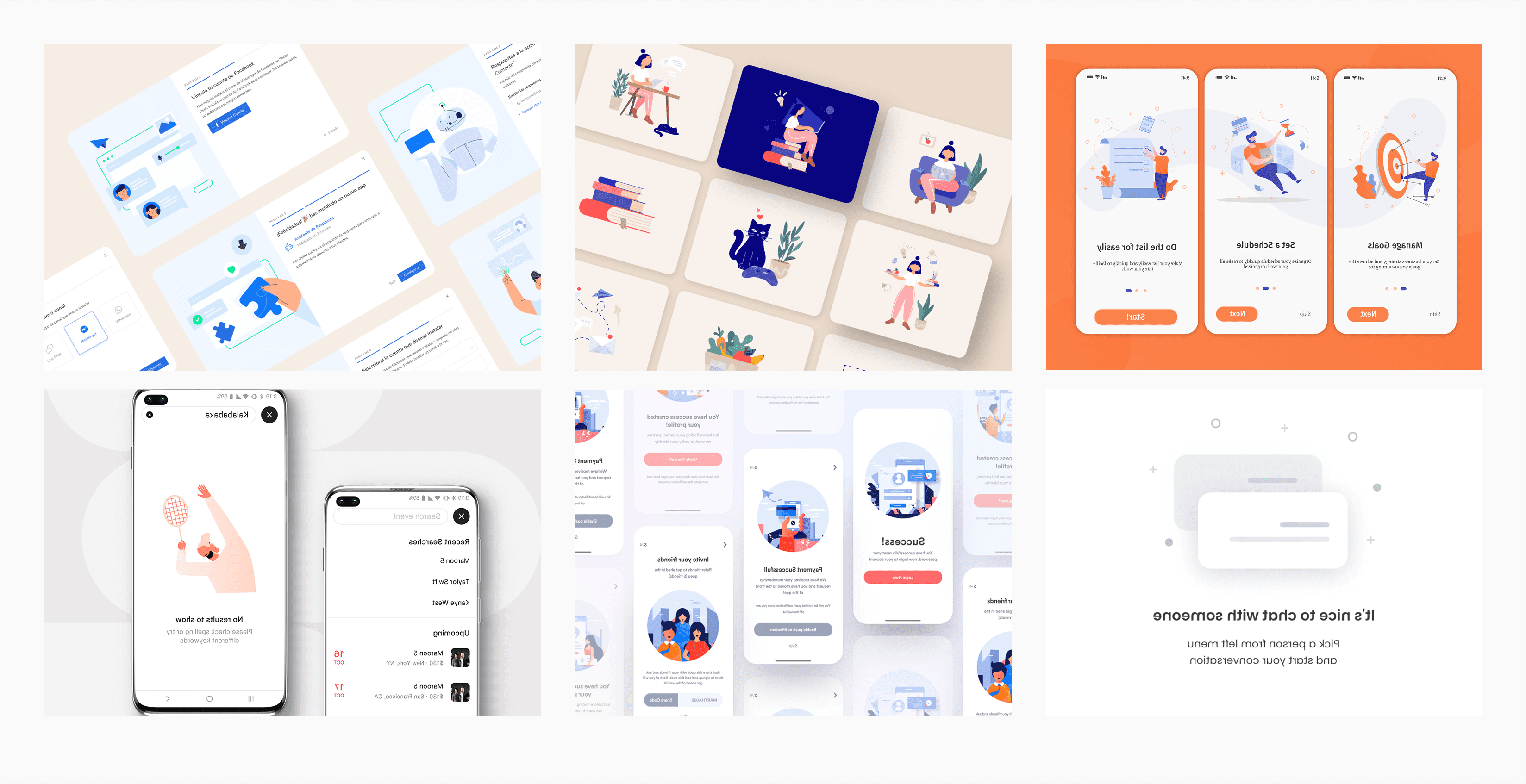
I wanted this illustration to be done very quickly because of the limited time period, so I started visiting available sources like Undraw, Blush, Storyset, Dailyflow, Getillustration, Drawkit etc. and started tweaking them to fit our tone.
I went through multiple iterations of various illustration styles, but none seemed to align well with the UI we had designed for the app. So I kept experimenting with different styles across various screens, trying to find the right fit.
One thing I consistently prioritised was simplicity, creating illustrations so straightforward that anyone could replicate them, reducing dependency on me. This is why I often leaned toward using prebuilt libraries as a solution.
Final Iteration
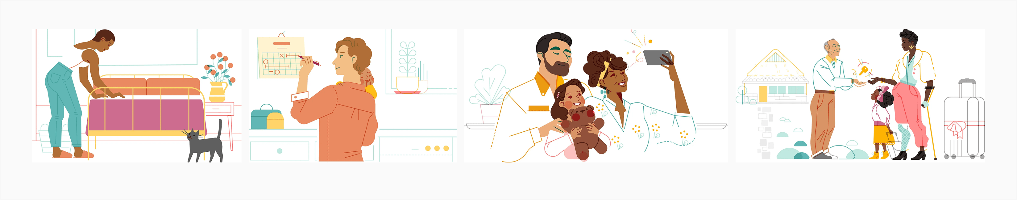
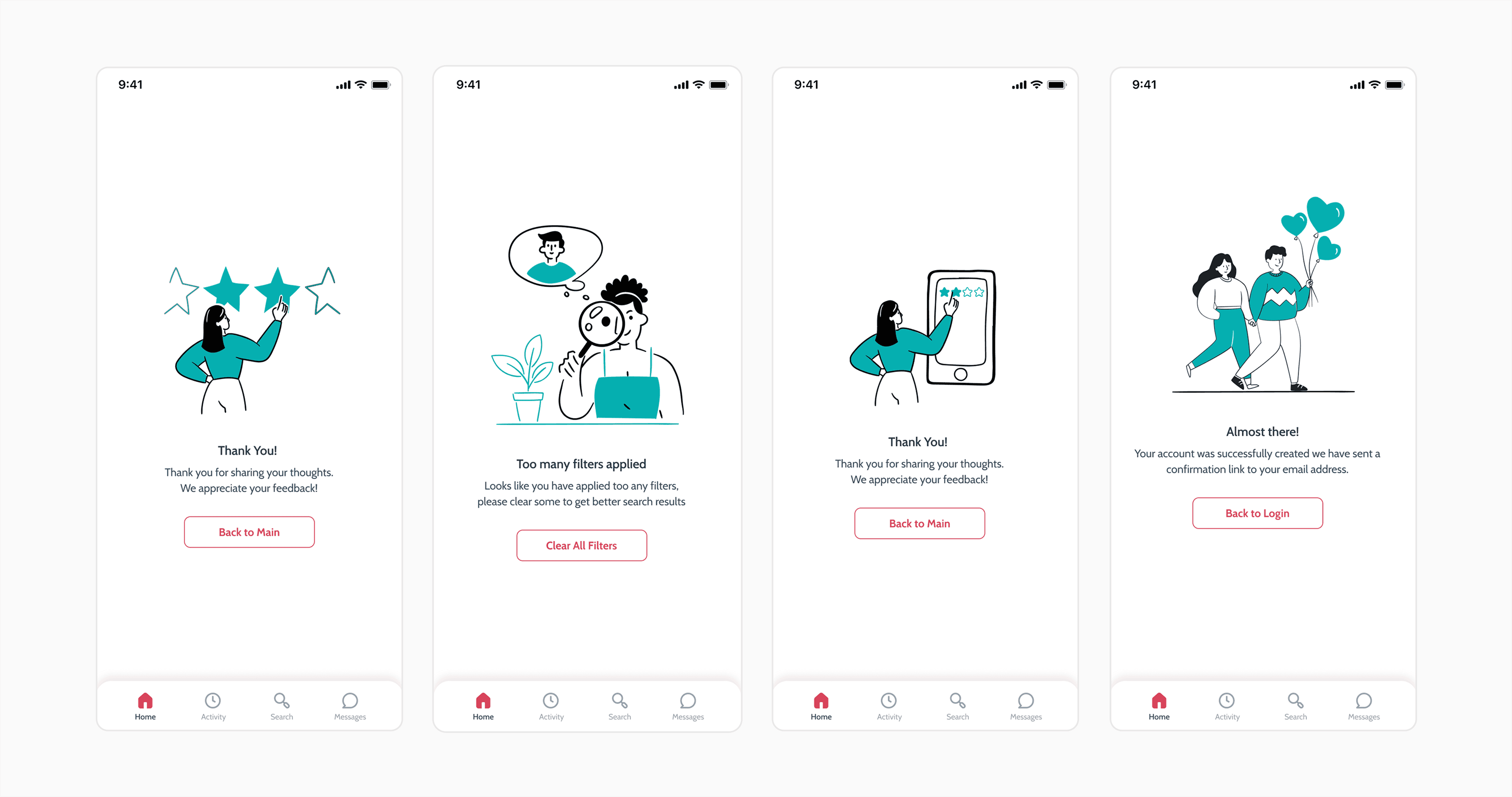
After trying many iterations, I found that these kinds of practices would not work. So I went back to our product philosophy and rethought all the key points, starting to explain them in detail: "Giving the delightful, simplified experience to our users."
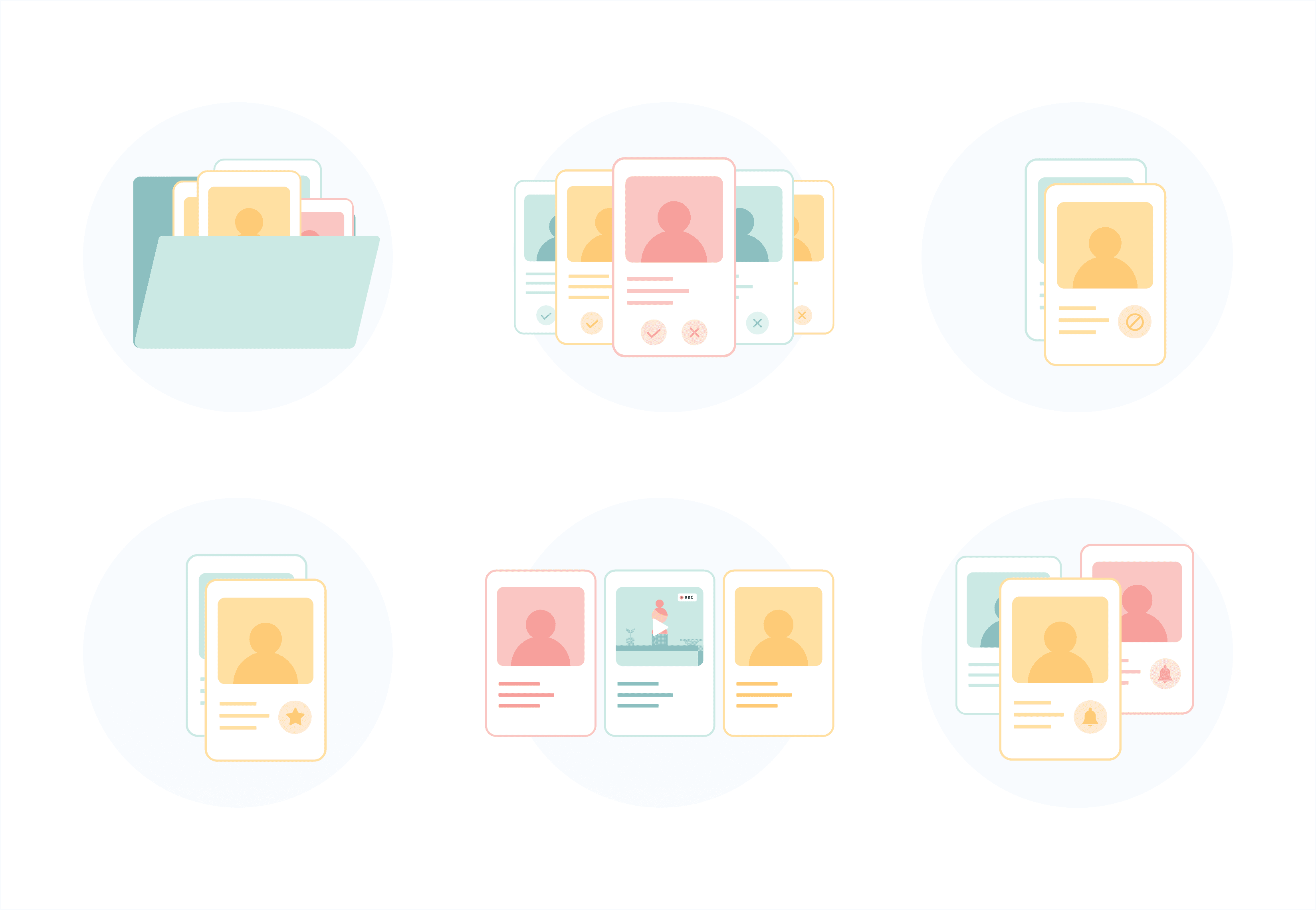
- Real-Life Inspiration: Illustrations focus on real-life scenarios and human connections, especially couples.
- Diversity in Users: Represent users with diverse facial tones, languages, cultures, and backgrounds.
- Embrace Differences: Showcase variations in race, age, ability, and body types.
- Keep It Real: Avoid stereotypes by depicting diverse identities beyond a single demographic.
When explaining these points I found that these are very detailed and complex stories that we are forming from these keywords, so I decided to cut these down and picked some simple words, simplicity, easy to understand, real life scenarios, human connections, human actions, and tried to form a very simple story line.
Adding Motion
After illustrating these, we felt that something was missing. The story that we wanted to convey from these static illustrations wasn't telling the exact story. So we tried to add motion. Motion is one of the best mediums to tell a story in a very short time, because static illustrations convey different meanings to different people, totally depending on how they interpret the form. Adding motion was again challenging for me, but I took it as a challenge and completed it.

Retrospective
This project was a transformative journey from uncertainty to clarity. Transitioning from UI/UX to illustration under tight deadlines and within an existing product style challenged me to rethink my creative process. Aligning illustrations with the product's language highlighted the importance of consistency, simplicity, and effective communication.
While prebuilt libraries offered speed, true resonance came from embracing our core values, real-life scenarios, diversity, and authenticity. When static visuals fell short, adding motion brought the illustrations to life, enhancing storytelling and user engagement.
In the end, embracing constraints, iterative problem-solving, and staying true to the product's ethos led to visuals that were not only cohesive and inclusive but emotionally impactful. These lessons will continue to shape my design approach.
"Illustrations turn information into emotion."