Automated Data Collection
Designing the system that lets investment teams request, track, and verify portfolio company data, without chasing anyone for it.
"A coordination problem disguised as a forms problem."
Introduction
PortfolioIQ is an investment intelligence platform used by VC and PE firms to manage portfolio company relationships, track performance, and prepare for board meetings.
Data Collection lets investment teams build structured request templates, send them to portfolio companies on a recurring schedule, and have data automatically extracted into the platform the moment a company responds.
My challenge was the end-to-end experience: how analysts configure requests, how companies respond, and how a submission becomes something the investment team can actually trust. That last part was the real project. Getting a company to fill out a form was the easy 20%. Designing a system that could represent where every request actually stood, for two audiences who didn't share a mental model, was the other 80%.
The Problem
Investment firms collect data from 20 to 200 portfolio companies every quarter. The metrics are always the same: MRR, ARR, headcount, burn rate, runway. The process for getting them is not.
Without a standard format, teams spend cycles manually chasing data that arrives in different formats every time. The result is real professional risk: analysts walking into board meetings with numbers they don't fully trust.
The deeper problem: two completely different user types sat on either side of every request, with no shared definition of "done."
Research
We spoke to investors and portfolio operators across Europe and the US, including in-person interviews at SuperReturns. The pain wasn't just anecdotal. It was structural. Every firm had built their own workaround: custom spreadsheets, email templates, manual reminders. None of it scaled.
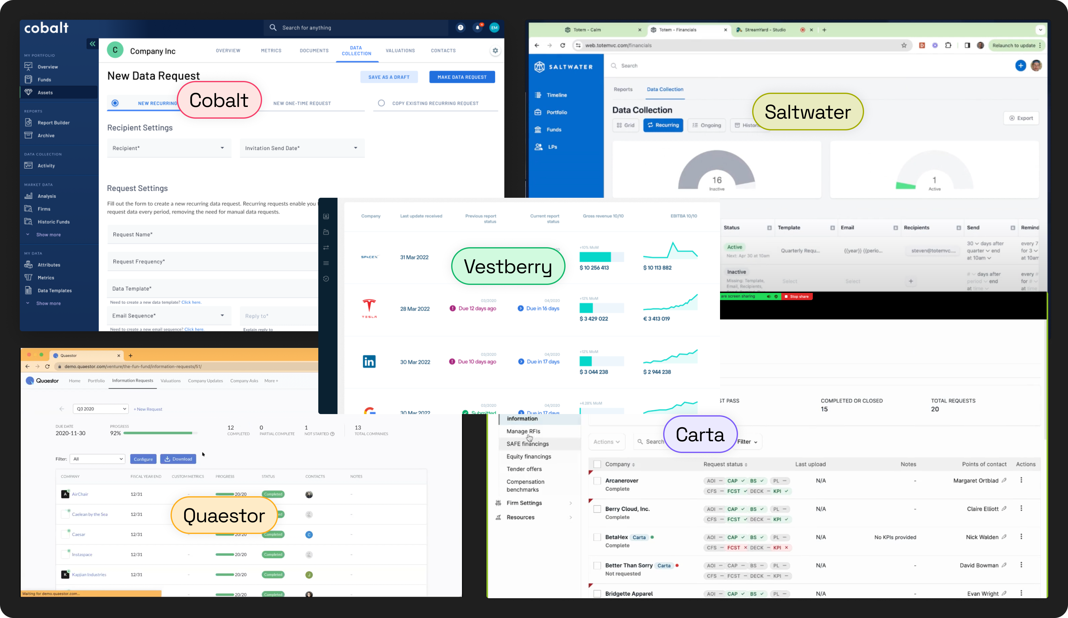
Competitive Landscape
We mapped the tools investment firms were already using or evaluating. Every existing solution optimized for the investor side. None had a purpose-built, two-sided experience where portfolio companies could submit structured data through their own portal.
The investor and the company live in opposite mental models. The investor tracks a request as a scheduled event with a due date. The company sees it as one task among many from different investors, with no consistent process.
"Done" isn't a single moment. A company can submit and still not have delivered what the investor needs. Fields blank, documents missing, numbers out of range. "Responded" and "verified" are two different states, and the design had to make that distinction visible on both sides.
Personas
Two roles sat on either side of every request. They never saw the same screen, didn't share the same language, and had fundamentally different definitions of what the system was for.
Strategy
The core insight: this isn't a data problem. It's a coordination problem. The data exists. The issue is there's no shared process for how it gets requested, submitted, and verified. We needed to design that process, and make it simple enough that both sides would actually use it.
Five decisions shaped what we built.
Investor-owned templates, not fixed forms
Different firms track different metrics. The builder needed to be flexible enough to accommodate that, but structured enough that submissions could be automatically mapped into the platform. The investor defines the template once, and it runs indefinitely.
Scheduled delivery, not manual sends
If sending required manual initiation every cycle, it wouldn't happen consistently. The system handles scheduling, reminders, and follow-ups automatically. The investor sets it once; the cycle runs itself.
Simple submission for the company side
Portfolio companies report to multiple investors simultaneously. Any friction in the submission would result in incomplete data. The company experience had to be fast, clear, and low-effort: one link, no login, the form pre-filled with the prior period's data.
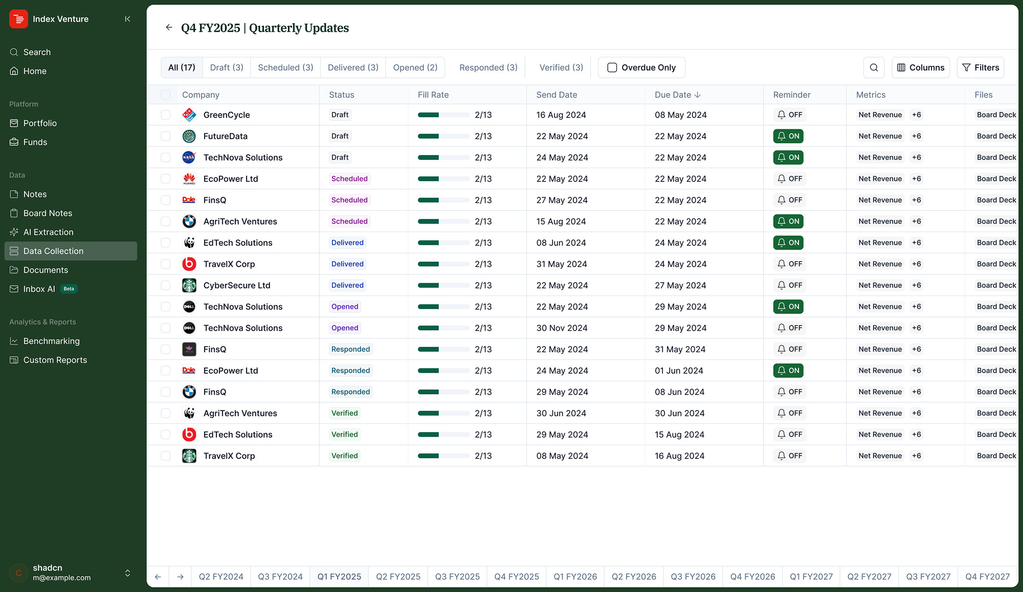
A status model that tells the truth
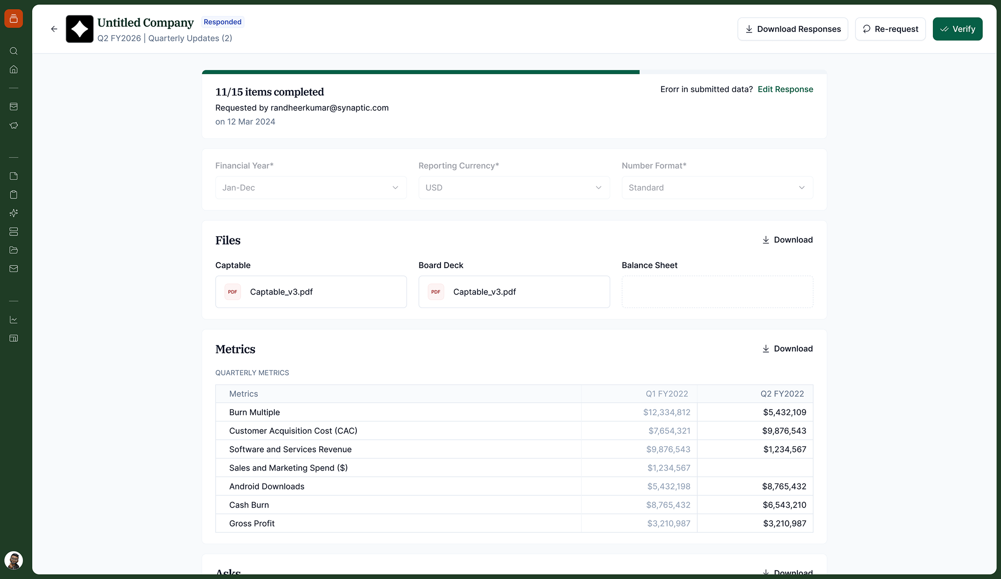
Early versions treated "responded" as the final state. But a response isn't the same as a verified submission. We modelled 10 distinct states: draft, scheduled, sent, delivered, opened, responded, verified, closed, plus resent and failed as branch paths, so the investor always knows exactly where each company stands.
Status examples: Draft Sent Opened Verified Overdue
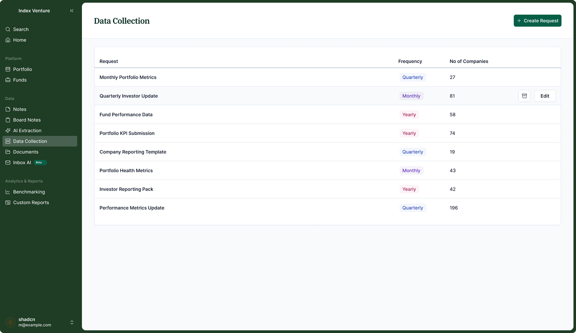
Spreadsheet-native navigation across periods
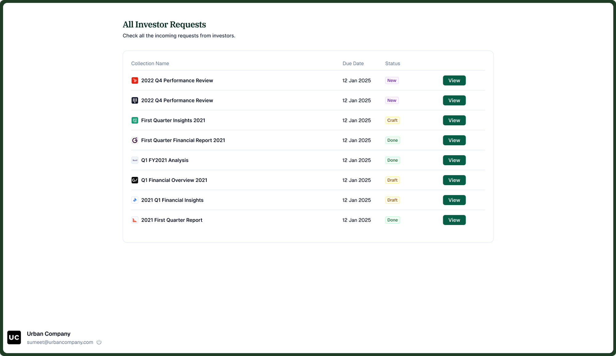
Investors already think in spreadsheets. The tracking view uses companies on rows, periods as tabs. Switching quarters doesn't reload the interface, just the data. The prior period column stays visible during submission so companies can reference last quarter without opening a separate file.
How It Works
The system is a three-step request builder for investors, a structured submission portal for portfolio companies, and a live tracking view that updates as responses come in.
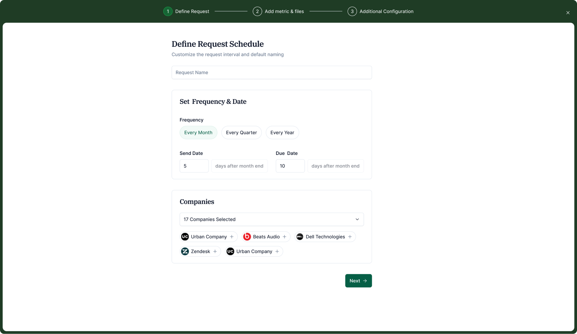
Define the request schedule
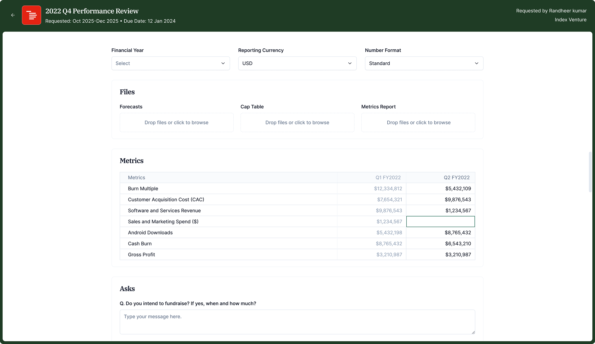
The investor names the request, sets the frequency (monthly, quarterly, yearly), defines send and due dates relative to the period end, and selects companies. The system handles delivery and reminders from there.
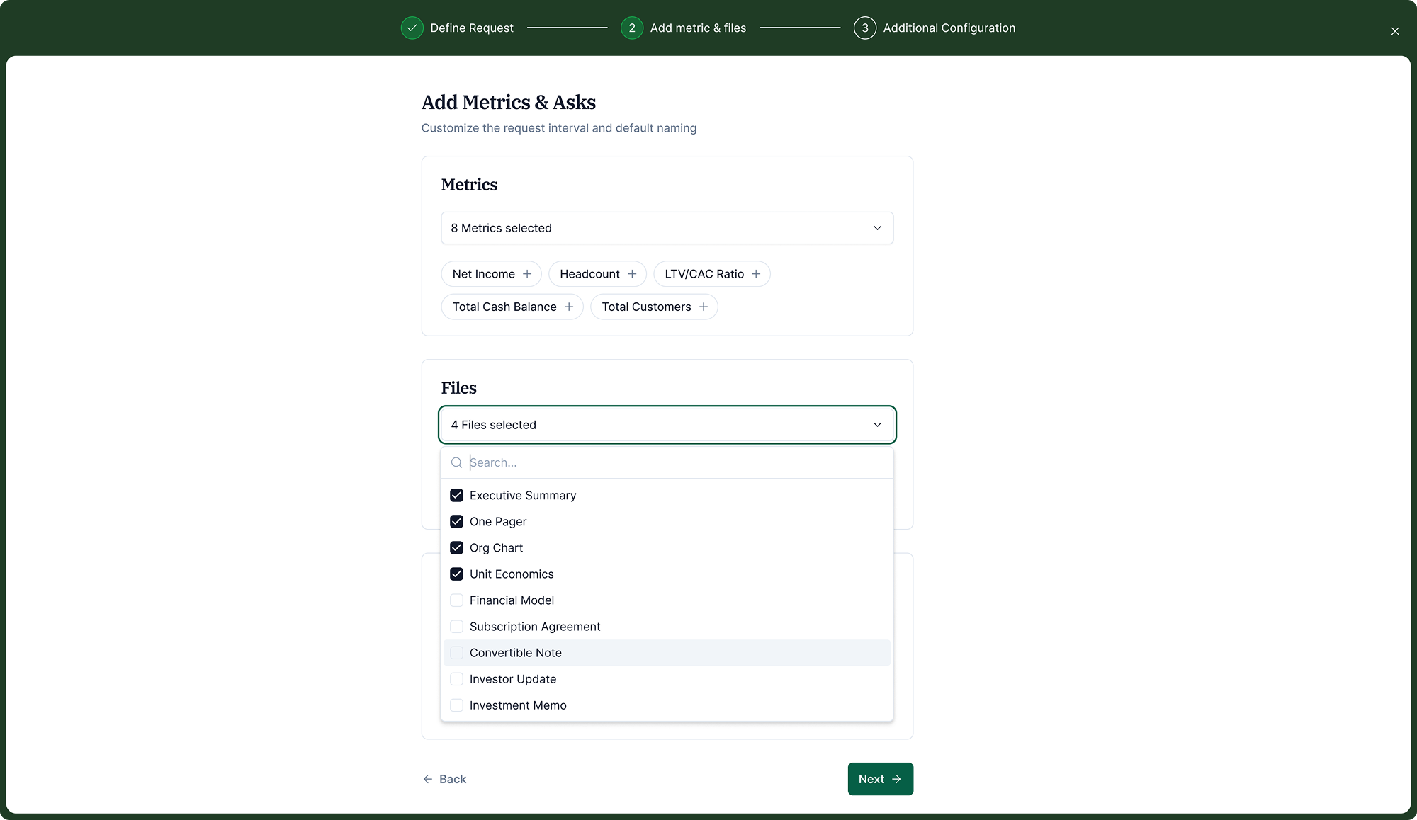
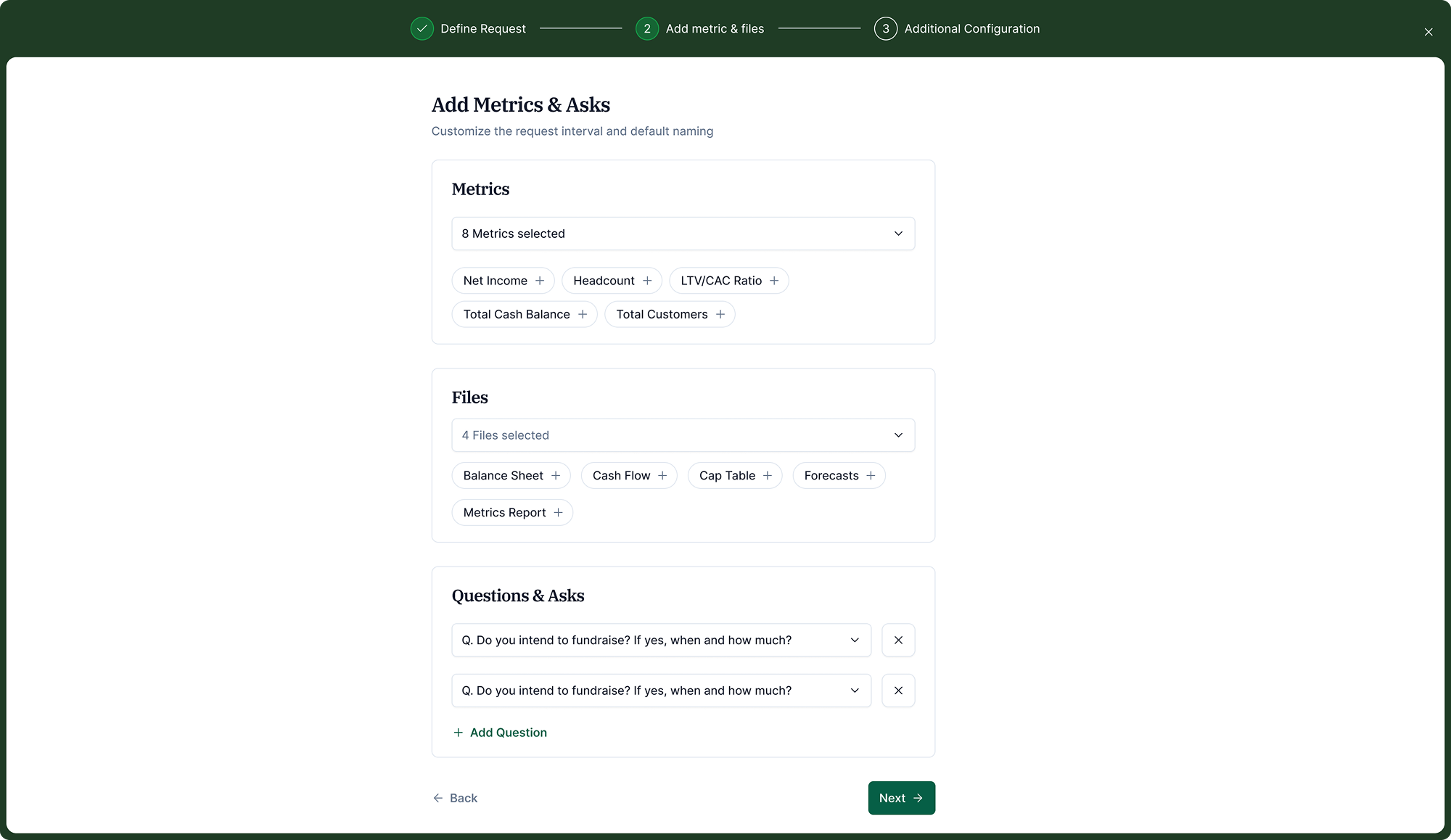
Configure metrics, files, and questions
The investor selects metrics, documents (board deck, cap table, forecasts), and optional free-form questions. Everything is drawn from a standard library or defined custom.
Set up the email template and reminders
The outgoing email is editable with dynamic variables (company name, due date, period). Automated reminders fire before the deadline, so no one on the investment team has to follow up manually.

Company Side
Companies receive a secure link by email, no account required. They see all pending investor requests in one place and fill in metrics or upload files directly in the form.
Key Design Decisions
Several decisions shaped the final design in ways that weren't obvious at the start.
A 3-step wizard, not a single long form
Configuration spans schedule, content, and communication. One scrollable form felt overwhelming in testing. Three focused steps, each with a single job, reduced configuration errors and improved completion rates. Steps are non-destructive, so analysts can revise before saving.
Status at the company level, not the request level
Early versions showed a single completion percentage. Analysts need to know which specific companies haven't responded, not an aggregate. The tracking view surfaces per-company status with fill rate inline. The 10-state model made this possible; a binary "pending / complete" would have hidden too much.
Prior period data visible during submission
Companies naturally reference last quarter when filling in new data. Showing the prior period column greyed out in the metrics table let them work faster with fewer errors. The tension was density: too much context clutters the form. The solution was to show only the single most recent period.
Multiple recipients per company, one submission
In practice, companies split responses across roles: the CFO handles financials, the CEO writes the qualitative update. We added multiple recipients per company, but kept one shared submission form. Anyone can update any section; the last-saved state is what gets submitted. This significantly reduced incomplete submissions in early testing.
Outcome
Investment teams moved from email chains to a structured, scheduled pipeline. Analysts could see exactly who had responded, what was pending, and where data was incomplete, without a single manual follow-up.
For portfolio companies, fragmented email threads were replaced with one structured form per cycle. Companies knew what was expected and could complete their submission in one session.
Retrospective
The hardest part was designing for two distinct user types with opposite contexts: the investor configures once and monitors many; the portfolio company responds to many investors every quarter. The same workflow had to feel completely different depending on who was using it.
If I were doing this again, I'd run dedicated testing with portfolio company operators earlier. Most early research was investor-facing, which shaped the configuration experience well but left us iterating the submission portal longer than needed.
Several pieces were deliberately left out of scope to ship a working system:
- Founder auth (login-gated submission) The submission form is access via a secure link, not a login. We scoped this out because requiring founders to create accounts would have added friction and reduced response rates at launch. The tradeoff: no persistent history for the company side. Worth revisiting once response rates are stable.
- Unified inbox for portfolio companies Companies receive separate links for each investor's request. A consolidated "all your investor requests" inbox would reduce confusion for companies dealing with multiple investors, but the coordination required between investors to support it was out of scope for v1.
- Overdue notifications for investors The system surfaces overdue status in the tracking view but doesn't proactively push alerts to analysts. A notification layer (email, in-app) for when a company goes overdue was a clear next step, but required more infrastructure than the backend timeline allowed at launch.
- Verified-to-records bridge Once a submission is verified, the data lives in the request. Automatically propagating verified metrics into the company's core profile (updating ARR, headcount, and so on), required schema decisions beyond the data collection feature. This was the most-requested missing piece in early customer interviews after launch.
What's Next
The verified-to-records bridge is the highest-priority next step: automatically propagating verified metrics into the company profile. This closes the gap between "data collected" and "data available."
Beyond that, the platform's AI extraction layer, which already parses uploaded documents to auto-fill metric fields, is the natural next surface to extend. The request form knows what's expected; the document knows what it contains. Closing that gap automatically is where the biggest time savings still live.